


How are aircraft liveries designed, and why are they so important to airlines?

10 min read
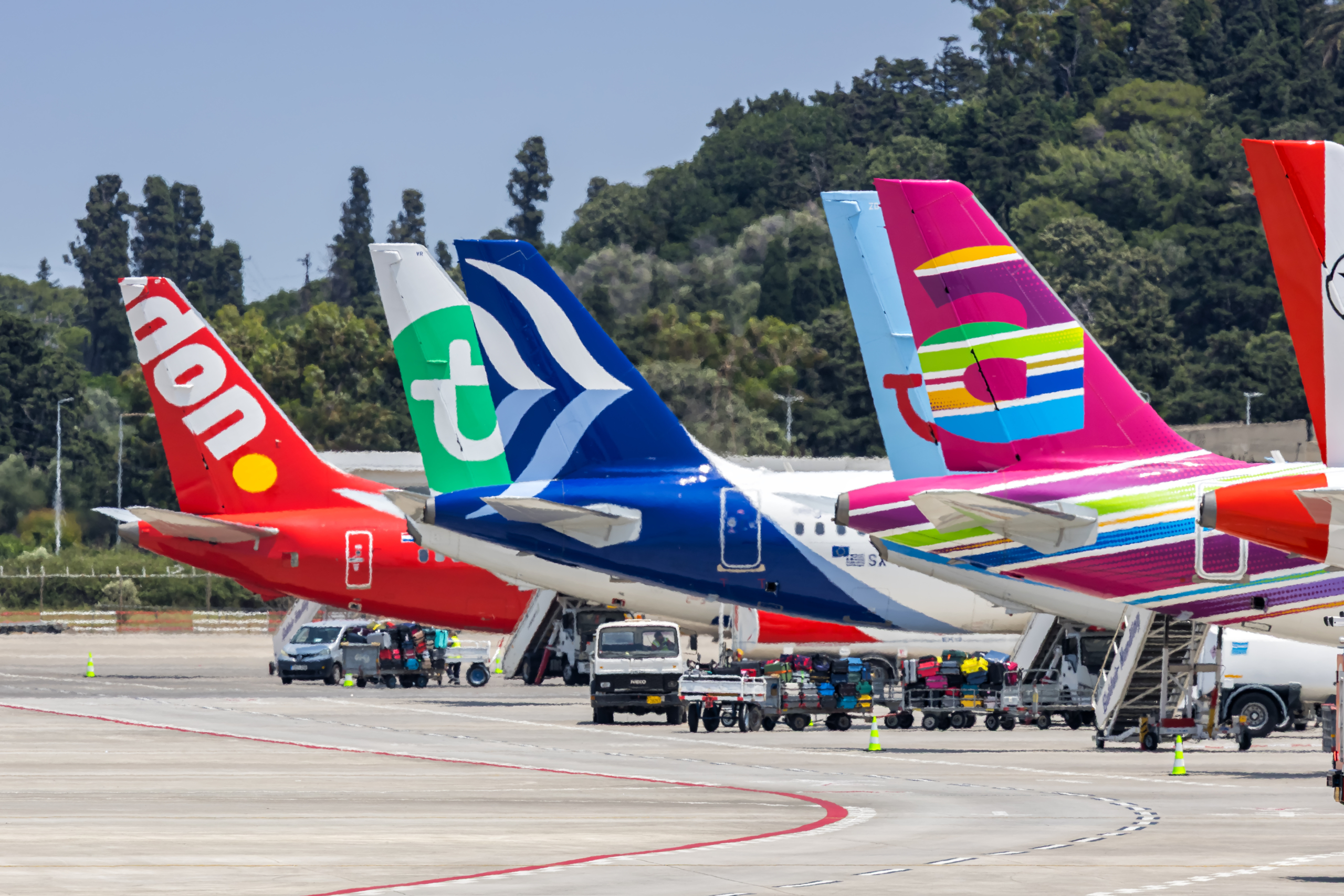
Look across an airport apron and one thing quickly becomes clear: every airline wants its aircraft to be recognisable.
Long before passengers board an aircraft, they encounter its colours, logo, lettering and distinctive design. An airline livery can turn an otherwise familiar-looking aircraft into a powerful symbol of a company. It can communicate luxury, reliability, national identity, modernity or even a sense of fun – often within just a few seconds.
But an airline livery is much more than a coat of paint. Creating one involves branding specialists, graphic designers, engineers, marketing teams and aircraft manufacturers. The final design has to look impressive in photographs and at an airport, while also working across different aircraft types and surviving the demanding conditions of commercial aviation.
So, how are airline liveries actually designed, and why are they so important? Aerospace Global News delves into the intricate and artistic realms of this fascinating subject.
What is an airline livery and why is it important?
An airline livery is the complete visual design applied to an aircraft. This normally includes the colours, logo, airline name, typography, patterns and other identifying features used on the fuselage, tail, engines and sometimes the wings and, these days, winglets, too.
Some liveries are deliberately simple, using one or two colours and a clean logo. Others are much more elaborate, incorporating gradients, flowing lines, national symbols or highly distinctive patterns.
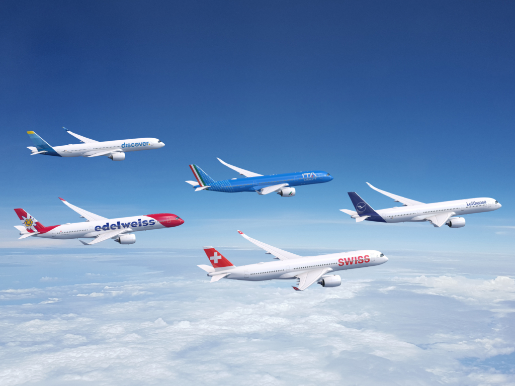
The aim is to create a design that acts as a shop window for an airline and that passengers can immediately associate with a particular carrier.
Ideally, someone should be able to spot an aircraft at a distance and know who operates it without needing to read the registration or flight number. That instant recognition is one of the main reasons liveries matter so much.
How airline brand identity shapes aircraft livery design
Before designers begin deciding where to place a coloured stripe or logo, they first need to understand the airline itself.
What does the airline want customers to think when they see its aircraft? Is it a premium carrier aiming to communicate sophistication? A low-cost airline trying to appear fun, energetic and approachable? A national carrier looking to represent its country around the world? These questions shape the entire creative process.
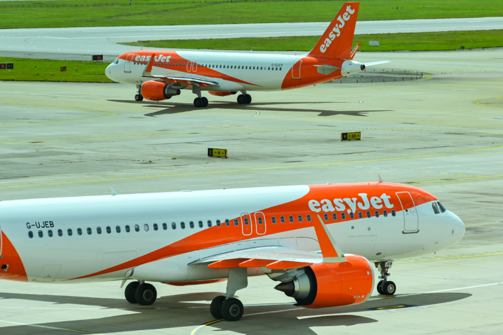
An airline that wants to emphasise luxury may choose restrained colours, elegant typography and a relatively uncluttered fuselage. A leisure airline might take a completely different approach, using bright colours and playful graphics to suggest holidays and relaxation.
The livery therefore becomes an extension of the airline’s wider brand. It needs to work alongside everything else passengers see, from airport check-in desks and uniforms to websites, mobile apps, advertising and lounges.
Why colour is important in airline livery design
Colour is one of the first things people notice about an aircraft, which makes it one of the most important decisions in livery design. Different colours can create different associations. Blue is often used to suggest trust, calmness and professionalism.
Red can create a sense of energy and confidence, while green may evoke nature, freshness or a connection to a particular place. White is extremely common because it creates a clean appearance and works well as a background for logos and other colours.
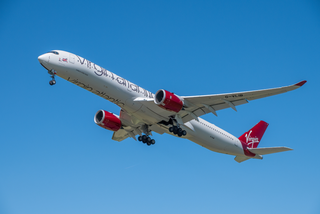
However, designers cannot simply choose a colour because it looks good on a computer screen. An aircraft can be viewed in bright sunshine, under artificial airport lighting, through a terminal window or in a photograph taken from several hundred metres away. Colours can look very different depending on the conditions.
The design also needs to remain recognisable at night and from a distance. This is one reason strong contrasts and relatively simple shapes are often effective.
Why aircraft tail design is crucial for airline branding
One of the most important areas of an aircraft livery is the tail, or in aviation parlance, the vertical stabiliser. When an aircraft is parked at an airport, the tail can remain clearly visible above buildings, gates and other aircraft. This makes it an ideal location for an airline’s logo, symbol or signature pattern.
Some of the world’s most recognisable airline brands have distinctive tail designs that can be identified almost instantly. In many cases, the tail design is more visually memorable than the airline name itself.
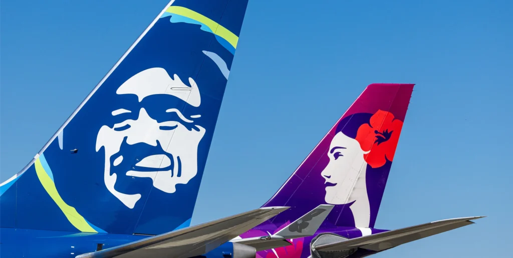
Designers therefore have to think carefully about how a logo or graphic behaves within the shape of the vertical stabiliser.
A symbol that looks excellent on a flat page may lose its impact when wrapped around the curved surfaces of an aircraft. The result needs to be clear, bold and easily identifiable from a distance.
How typography and logos are used in aircraft liveries
The airline’s name is another major part of a livery. Typography needs to be highly legible, particularly when viewed from a distance or in poor weather. At the same time, it needs to reflect the character of the brand.
A modern airline may use clean, minimal lettering, while a more traditional carrier might favour a typeface with a stronger sense of heritage.
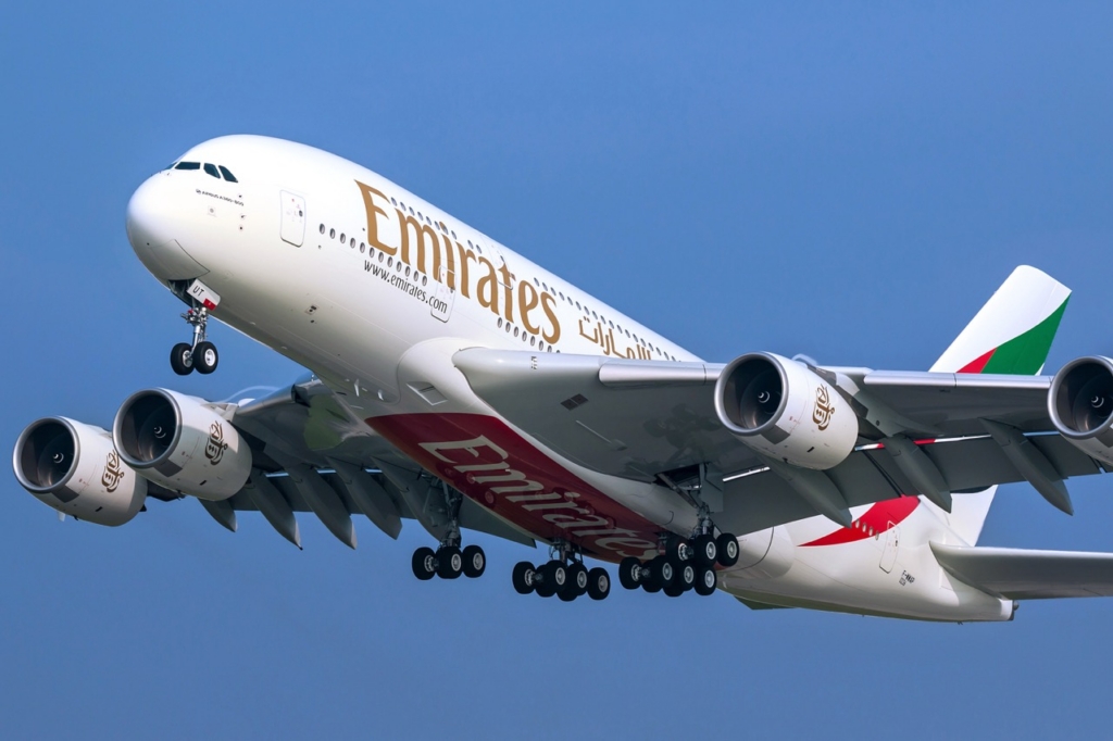
The size and placement of the lettering also matter. Designers have to consider the position of passenger windows, aircraft doors, emergency exits and other structural features.
A logo cannot simply be placed wherever it looks best visually – it has to work around the aircraft itself. Some airlines develop custom typefaces or modify existing fonts so that their aircraft have a more distinctive appearance.
The technical challenges of aircraft livery design
An aircraft may look like a simple surface from the ground, but it is anything but simple for a designer. The fuselage is curved. The nose tapers. The engines have their own shapes and surfaces.
Doors, windows, antennas, panels and other equipment all interrupt the aircraft’s structure. This means a livery has to be designed three-dimensionally. A graphic that runs perfectly straight on a computer screen could appear distorted once it is painted around the fuselage.
Curved lines can change direction, logos can become visually unbalanced, and patterns may not align from one section to another.
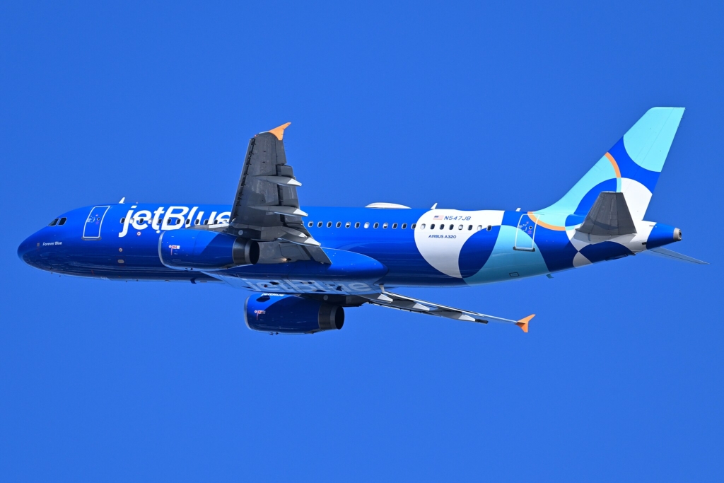
Design teams therefore create highly detailed aircraft-specific artwork showing exactly how every part of the livery should be applied.
How airlines adapt liveries across different aircraft types
Airlines rarely operate just one aircraft type, creating another major design challenge. A carrier may have Airbus A320-family aircraft for short-haul services, Boeing 787s for long-distance flights and larger Airbus A350s for high-capacity routes.
Each aircraft has different proportions, window arrangements, doors, engines and tail shapes. The airline still wants the fleet to feel like one coherent brand.
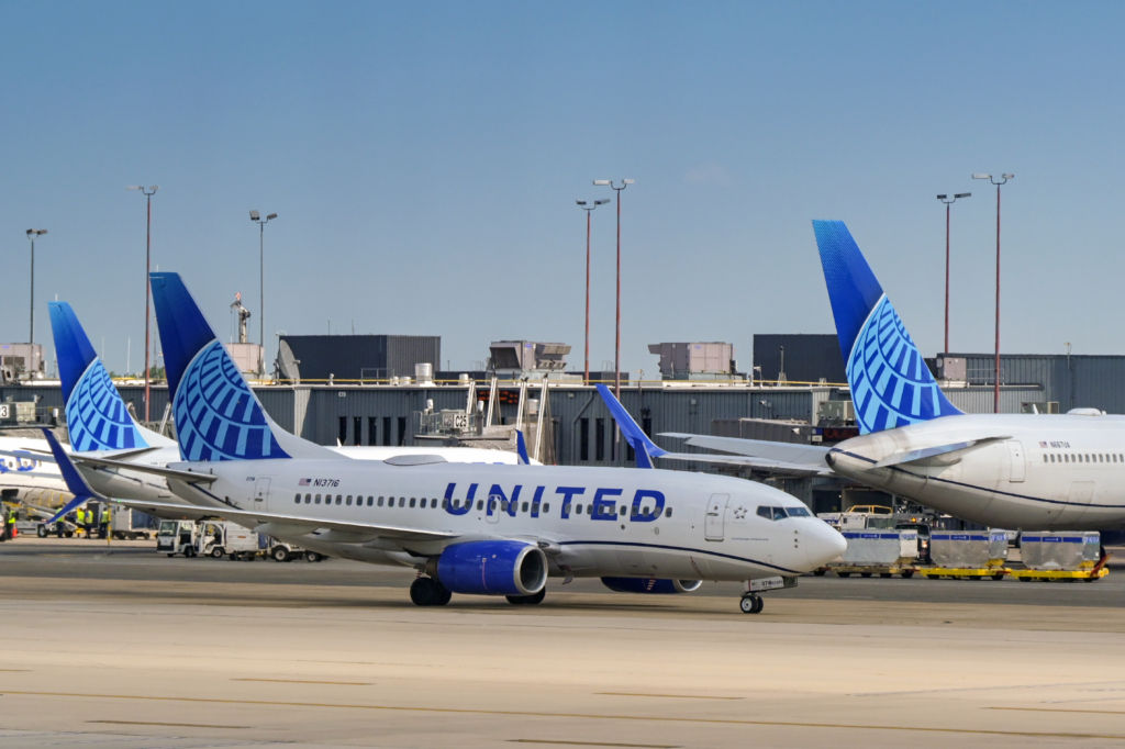
As a result, designers develop a visual system rather than simply one fixed image. The basic colours, logo, lettering and major design features remain consistent, but individual elements are adapted to suit different aircraft.
A successful livery should look unmistakably like the same airline whether it is seen on a small regional jet or a large wide-body aircraft.
Aircraft paint: Weight, durability and maintenance
The practical side of painting an aircraft is just as important as the visual design. Aircraft operate in demanding environments.
They experience intense sunlight, heavy rain, extreme temperatures, de-icing chemicals and regular cleaning. A livery must therefore be durable enough to remain attractive throughout the aircraft’s working life.
Weight is another consideration. Airlines carefully manage aircraft weight because carrying unnecessary mass can increase fuel consumption. Modern aircraft paint systems and application methods are therefore designed to achieve an attractive finish without adding unnecessary weight.
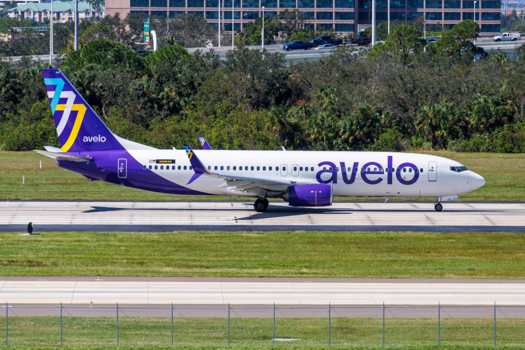
Maintenance matters too. A complicated design involving numerous colours and intricate patterns can take longer and cost more to apply and repair. For a major airline with hundreds of aircraft, even a small increase in painting or maintenance costs can become significant.
Why airlines invest so heavily in liveries
The biggest reason is branding. An aircraft is effectively a flying billboard. It travels between cities, appears in airport photographs, features in news coverage, and is constantly shared on social media.
Thousands of people can see an airline’s aircraft without ever buying a ticket. That makes the livery an extremely effective way of building brand recognition.
A distinctive design can also help an airline stand out in a crowded airport environment. Rows of aircraft can look surprisingly similar, particularly when viewed from a distance. A strong livery immediately tells passengers which company operates a particular aircraft.
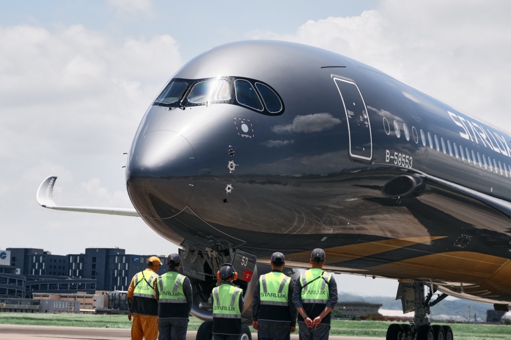
In a highly competitive industry, that recognition has real value. Additionally, liveries can influence how passengers perceive an airline. Although a paint scheme cannot determine the quality or safety of an airline, visual presentation can influence people’s first impressions.
A clean, carefully maintained aircraft can reinforce a sense of professionalism. A consistent visual identity across aircraft, websites, uniforms and airport facilities can make the company feel more established and trustworthy.
This is particularly important for airlines because passengers place enormous importance on confidence and reassurance. Flying is an unusual form of travel: customers are placing themselves in the hands of a company they may know very little about.
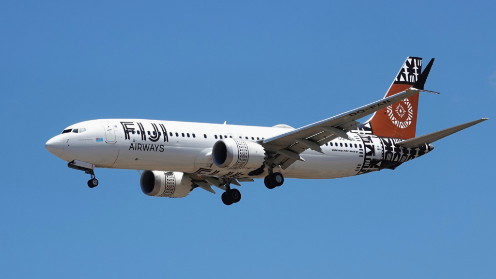
A strong brand can therefore play an important psychological role, helping passengers feel that the airline is organised, professional and dependable.
How airline liveries reflect national identity and culture
For many airlines, a livery also represents something bigger than the company. National carriers often incorporate colours, shapes or symbols associated with their home country.
In these cases, an aircraft can become a highly visible representation of national identity.
This can create a strong emotional connection for passengers from the airline’s home market. Seeing a familiar national symbol on an aircraft arriving overseas can evoke a sense of pride and familiarity.
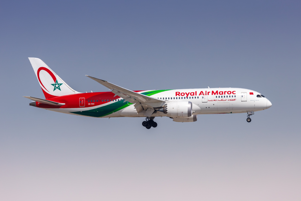
At the same time, international passengers may begin to associate the airline’s visual identity with the country itself. The aircraft effectively becomes an ambassador for both the company and its home nation.
Why airlines redesign their aircraft liveries
Airlines do not redesign their liveries without careful consideration. A new design can signal a significant change in the company’s direction. It might accompany a merger, a rebrand, a new ownership structure, a new business strategy, or an effort to attract a different generation of customers.
For an established airline, changing the livery can be particularly risky. Customers may have strong emotional connections to familiar colours and symbols.
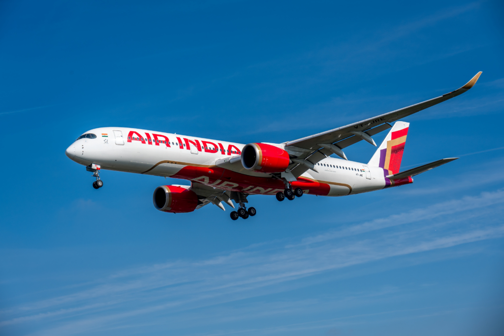
The challenge is to look modern without losing the elements that make the brand recognisable. This is why many successful redesigns retain familiar colours, symbols or visual characteristics while simplifying the overall appearance.
How airline liveries become aviation icons
Some designs become so iconic that people remember them decades after the aircraft themselves have disappeared. Airlines sometimes take advantage of this by painting modern aircraft in historic or ‘retro’ liveries.
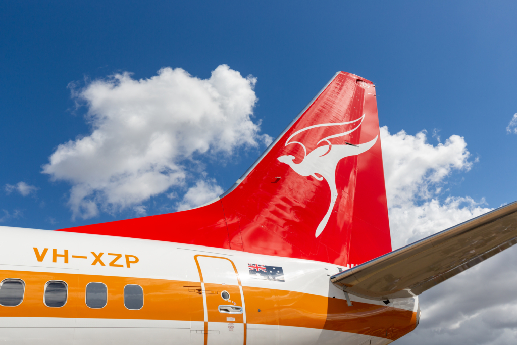
These designs celebrate an airline’s heritage while creating a sense of nostalgia for passengers and aviation enthusiasts. A retro aircraft can also generate huge attention online, demonstrating that a livery can have value far beyond its original practical purpose.
Aircraft liveries – a visual signature
Ultimately, an airline livery is the visual signature of an airline. Its creation requires a careful balance between creativity, engineering, marketing, cost and practicality.
Designers must consider everything from colour psychology and typography to aircraft geometry, paint durability and fleet consistency.
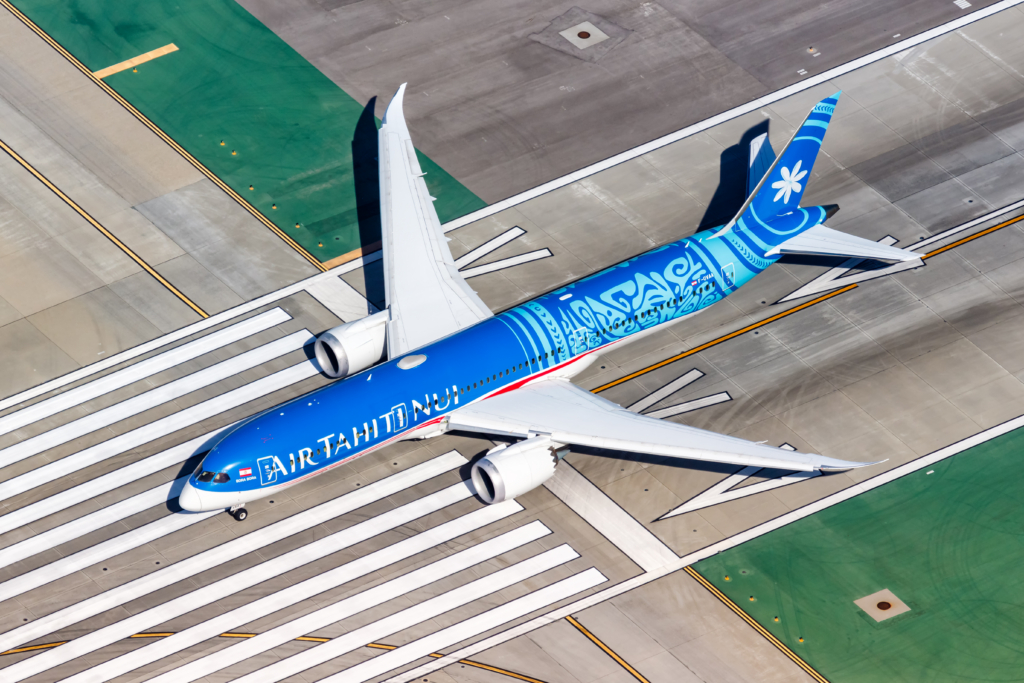
But the effort is worthwhile because a successful livery can do something remarkably powerful: it can turn an aircraft into a recognisable symbol.
Every time an aircraft taxis onto a runway, arrives at a gate or appears in a photograph, its livery communicates something about the airline operating it.
The best liveries are therefore not simply attractive designs. They tell a story, reinforce a brand and create an identity that passengers can recognise almost instantly.
In an industry where airlines often compete on similar routes using similar aircraft, that distinctive visual identity can make all the difference.
Sign up for our newsletter and get our latest content in your inbox.


More from

September 11, 20265 min read

September 12, 20264 min read


